
coconut
A created-from-scratch typeface designed for travel brochures.
00

Inspired by the relaxing feeling of a tropical vacation, Coconut is a bold and friendly typeface, intended for travel brochures to invoke the excitement of paradise.
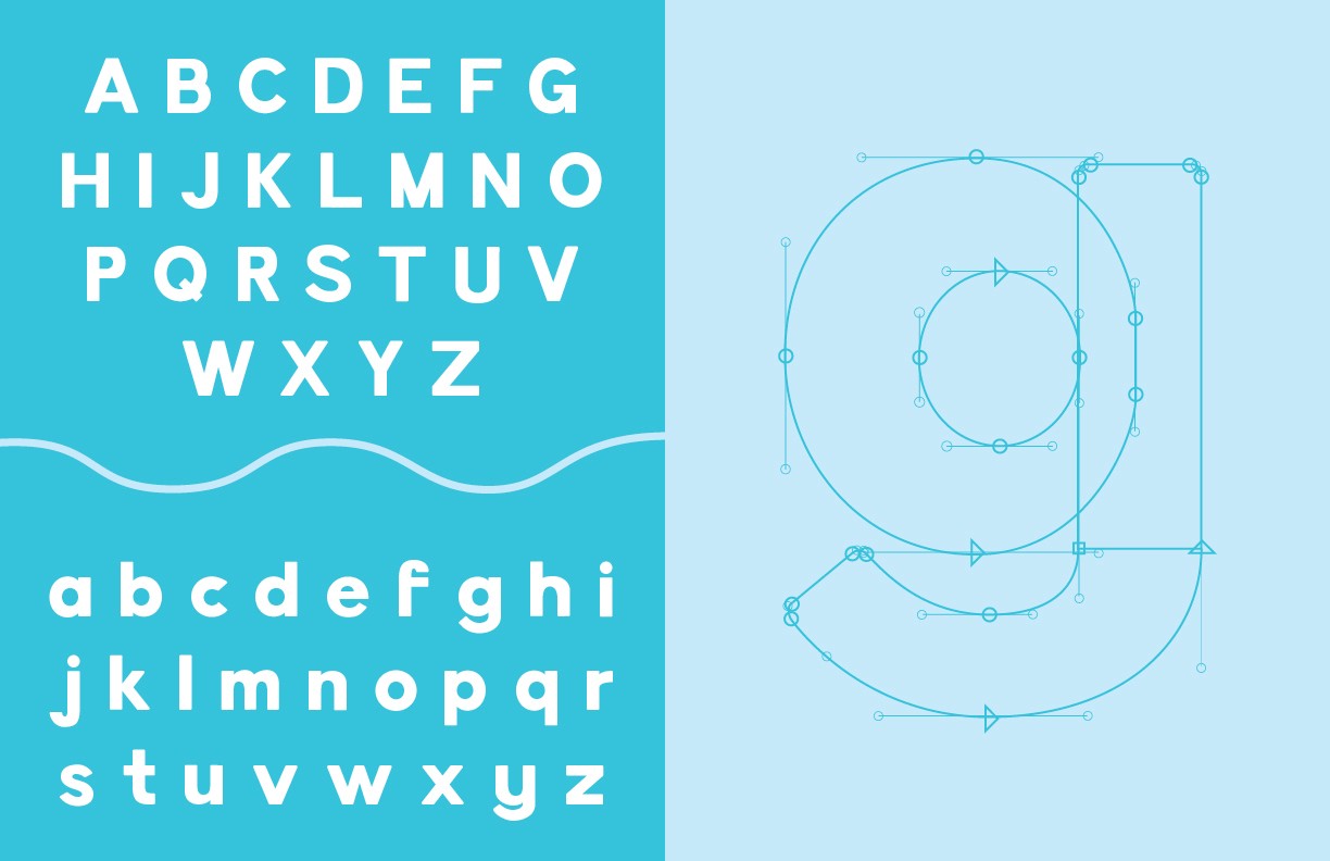
This was my first experience with typeface creation. It was an interesting process, especially struggling to nail down the perfect "s" or figuring out a counter size that looked right. I took inspiration from bold yet simple display typefaces, and figured out how to add quirks that made the typeface unique while still remaining readable and simple. For example, the curvature of the descenders in letters such as "g" or "y" is tight, but round, making the letters look unique and a little fun while still fitting with the rest of the typeface.
Creating this typeface was a two-part solution, however. As part of this project we were responsible for creating a type specimen book showcasing the typeface itself. I researched tropical brochures, getaway packages, and more. I wanted something simple that didn't detract from the booklet- so no photographs. I even took some inspiration from Animal Crossing: New Horizons' tropical imagery. I wanted exploring the book to feel like exploring a tropical island from start to finish, with motifs of water, sunsets, and seaplanes.
01

02

see also


